Getting started
Before using the dashboards module:- Set up event tracking.
- Connect at least one data source.
- Define at least one conversion.
Navigation
- Access the dashboards module by navigating to the Dashboards tab in the main menu.
- Switch between different dashboards by clicking on the dashboard name.
Date filters
The date filter in the top right lets you specify a date range to view metrics and charts, or compare two distinct periods such as the previous week.Creating dashboards
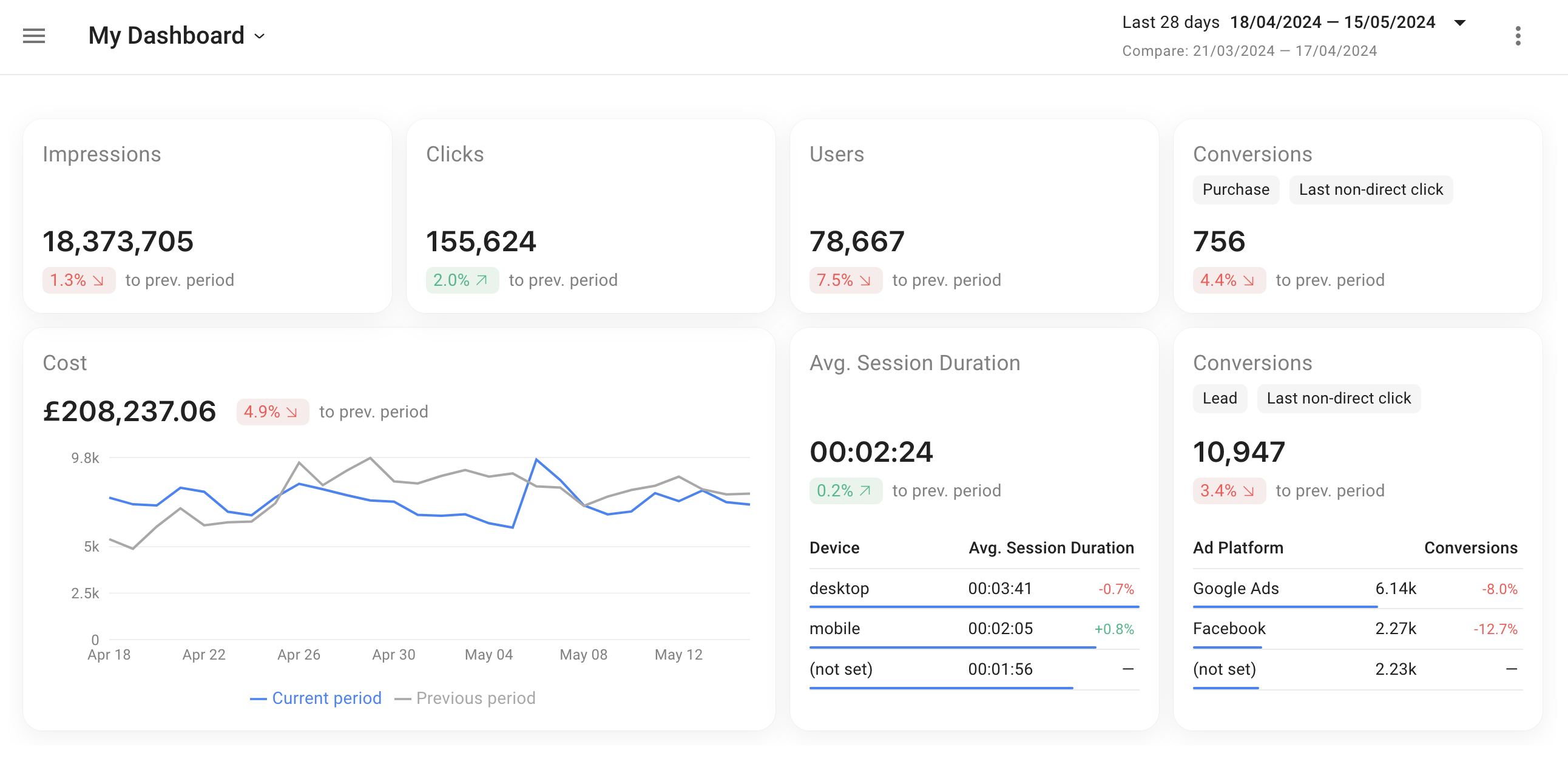
Your project comes with a default “Overview” dashboard displaying basic metrics. You can customize it or create a new one.1
Open the dashboard menu
Click on the name of the current dashboard in the left part of the top menu.
2
Add a new dashboard
Click + Add dashboard.
Dashboard customization
1
Enter edit mode
Click the three-dot menu at the top right of your screen and select Edit.
2
Arrange your dashboard
While in edit mode, you can:
- Rearrange blocks by dragging and dropping them.
- Resize blocks by dragging the lower right corner.
- Add new widgets by clicking + Add widget in the top menu.
3
Save changes
Click the Save button on the top right corner. All adjustments are shared with users who have access to the project.
Widget settings
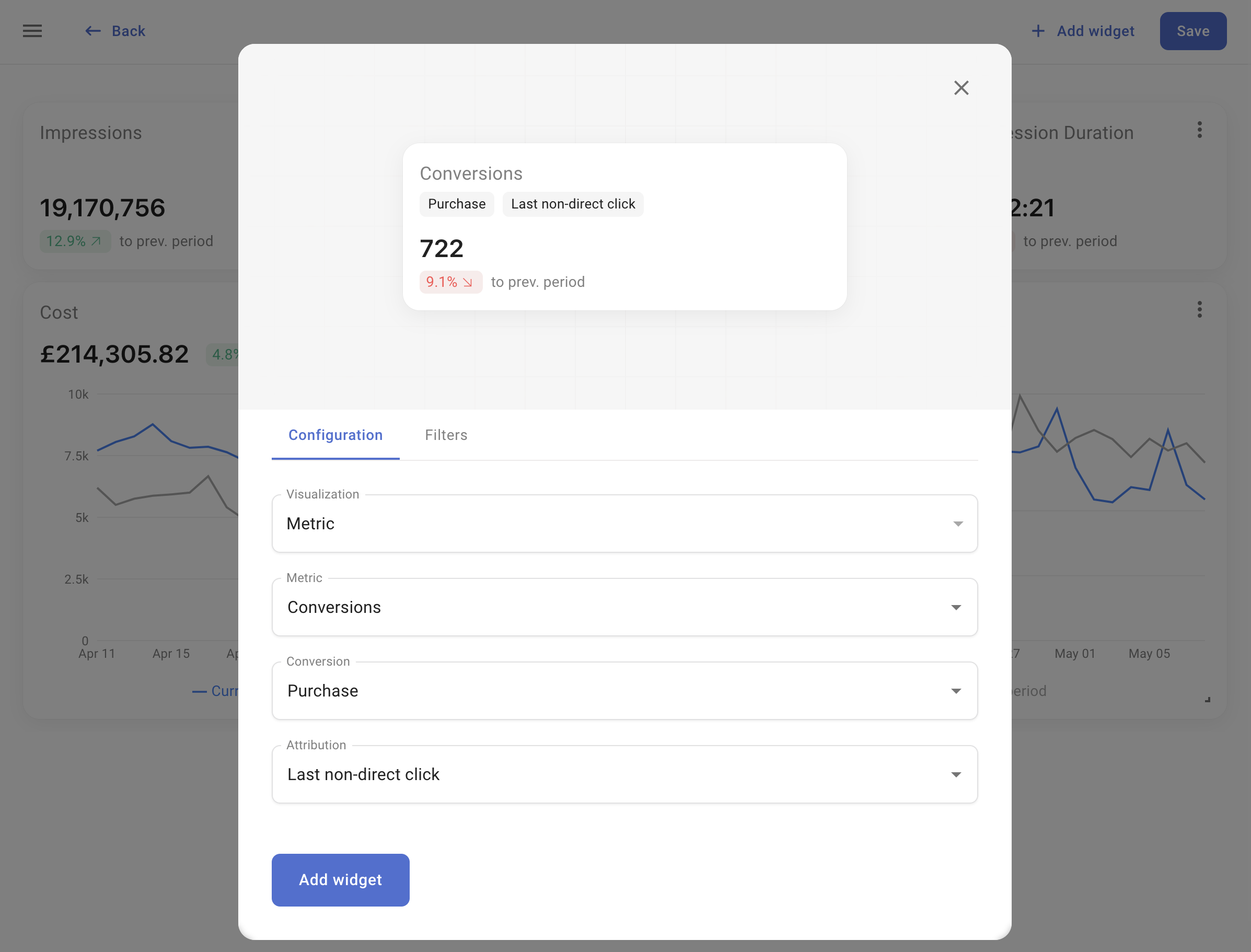
When adding or editing a widget, you can preview it before adding it to your dashboard.Configuration
In the Configuration tab, select the visualization type and the metric you want to display.- Metric
- Line Chart
- List
Displays the numerical value of a single metric.
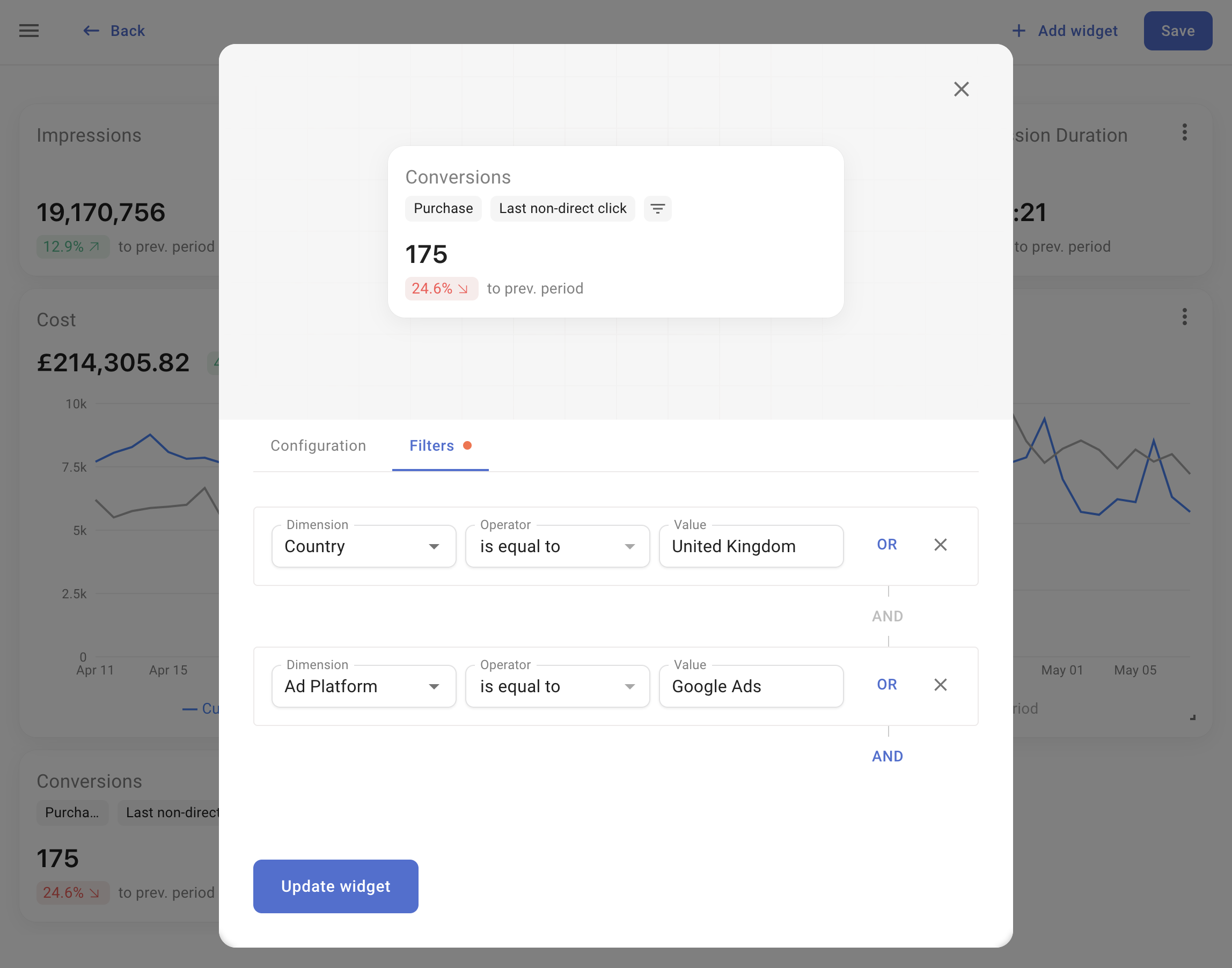
Filters
Use the Filters tab to apply filters to metrics based on dimension values. Each filter row represents a rule. For example, to view data exclusive to visitors from the UK:- Select Dimension: Country
- Choose Operator: is equal to
- Pick the value for the United Kingdom from the dropdown.
- Display metrics where Ad platform is equal to Facebook Ads AND Country is equal to United Kingdom
- Display metrics where Country is equal to United Kingdom OR Country is equal to United States
- Display metrics where Campaign contains the word SALE